FudgeGate: CDC Caught Fudging Vaccine Mortality Data
Just when you think they couldn't stoop any lower
Currently, there’s a Tweet doing the rounds by Elisabeth Bik that shows this terrible graph from the United States suggesting unvaccinated people are dying at higher rates than vaccinated. Ironically, she berates Bluechecks as being ‘paid’… as a Bluecheck herself:
The graph shows deaths divided by the total population who fall into each category (even though this doesn’t say anything about mortality on a case-rate basis).
At first it seems like the pro-vaccine crowd has a slam dunk — ignoring the fact they’ve excluded the 2020 and 2021 datasets for comparison and focused unnaturally on a post April 2022 for some reason. A tragic looking graph!
Also ignore the fact they have split the vaccinated groups into three categories to help them limbo under even further. Even this trick isn’t enough for the mind-bending fudge you are about to see from the CDC.
So, how do we know there’s a fudge?
Checking The Original Source Material
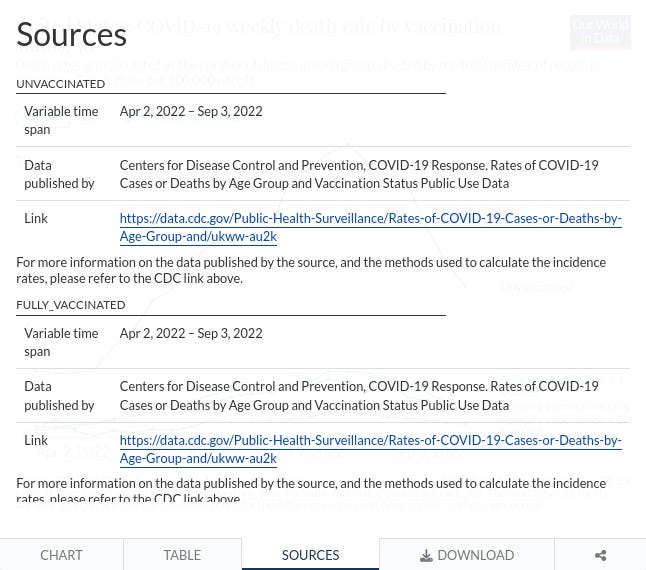
If we follow Elizabeth’s link, and scroll until we find the United States graph, we find it has a sources tab at the bottom:
If we click the sources tab, we find that the same link is used as the source for all the datasets:
That link being: https://data.cdc.gov/Public-Health-Surveillance/Rates-of-COVID-19-Cases-or-Deaths-by-Age-Group-and/ukww-au2k
If we visit that link, we find there is an export button on the right.
If we click that, the CDC website offers us a download of the dataset in CSV format. For our purposes, we just use ‘CSV’ on the left.
Analysing The CSV Dataset
The CDC isn’t going to give us an easy time double-checking their handiwork, so naturally we’re going to have to analyse and pick apart the ‘Rates_of_COVID-19_Cases_or_Deaths_by_Age_Group_and_Vaccination_Status_and_Second_Booster_Dose.csv’ dataset. Rolls right off the tongue!
Using data→autofilter (in LibreOffice Calc) we can sort the data so it is more readable.
Filter age_group to all_ages, and filter vaccine_product to all_types.
You will notice under the outcome column there are two types of outcome — case, for infections, and death.
This Is Where The CDC Fudge Begins
The CDC thought, for some reason, that if they gave both case and death for the same month, for the same week, and for the same group, two completely different population values, that no-one would notice. Maybe they were hoping people were too lazy to check?
If we set the autofilter on the month column to just MAR 2022, you will immediately see what we mean:
Notice the mmwr_week column (C), which shows both datasets share the same week, 202213 (Year 2022, week 13). Somehow we’re supposed to believe all categories dropped in population or they all somehow increased (including unvaccinated!). Unvaccinated isn’t even a whole number!
We can see the same thing occur in other months. If we pick JUN 2022, and pick one consistent mmwr_week (2022 22), we see the same inconsistent reporting!
Population figures are again lower in all categories in the death rows. And the same floating point number persists for the unvaccinated! Apparently there’s .05 of a person who is unvaccinated. What?
The Graph Compounds The Fudge
By dividing deaths by population numbers — where population numbers are clearly inconsistent and have been surreptitiously altered by the CDC (ignoring the three-way split and the absence of 2020 and 2021 data) — the graph can be used to paint any good looking picture of vaccines…
…except the dataset used for it is quite clearly inconsistent and bunk. It is impossible to believe CDC didn’t notice and this looks malicious, especially with the other omissions and tricks used.
Check it for yourself!
Download the dataset from here whilst the CDC haven’t yet covered up their fudge, follow our steps and check for yourself. We will keep a backup copy of the original dataset here in the event CDC opts to censor and hide their malicious reporting.
If you’re interested in even more FudgeGate, see Return of the Fudge.
Subscribe to get more content like this from The Daily Beagle.
Learned something new?
And leave a comment below:


CDC fudged the 2021 data, claiming that 25-44y covid mortality was up 150% while 85+y covid mortality was DOWN 25% at the same time. Simply unbelievable.
I think the best debunk of this nonsense is Joel Smalley’s film showing more Covid deaths in the year after the rollout than in the year before, in almost every country in the world.
https://open.substack.com/pub/metatron/p/whats-the-story-of-the-covid-19-vaccines?r=peo1w&utm_medium=ios&utm_campaign=post